 The day I married my wife, she put her brand on me. No, it wasn’t anything in the BDSM realm (I don’t even know if I got that acronym correct). The brand she put was on my heart and I wouldn’t have had it any other way. Today is my birthday and we are finally at the age where we don’t really get excited to be another year older. In fact, I think I quit that when I turned 19 (drinking age in Wyoming at the time).
Well, speaking of Wyoming, my book hasn’t been moving nearly as quickly as I’d like. I know, I know, you don’t need to blast me with the very accurate advice that patience is not only a virtue, it’s absolutely necessary to have even a shot at success in this ruthlessly inconsistent business.  And I do have a 90-day national-level campaign for its release just getting ready to kick off, and those who have read it and/or reviewed it have seen in it what I see in it, but as we all know, it’s a HUGE chore reaching the masses. A couple days ago a big change that started off as a small snowball discussion of branding (advertising branding) turned into a full-fledged avalanche (and believe me, we take those VERY seriously in Colorado, both the “coming hard down the mountain” kind AND our hometown NHL hockey franchise—RED WINGS SUCK! Sorry, that’s a form of hockey Tourettes that all Avalanche fans have {shakes fist} <~that’s for my friend in Detroit who never reads my blog; come to think of it, I have a lot of “friends” who don’t read my blog…I may be on to something here {shakes fist}).
Anyway, my wife, in her wisdom (i.e. BIG BRAIN) thought that no one was buying my book because of the gorgeous cover I made. Confused? Well, it wasn’t the cover, but rather the badass-looking cowboy on it. Not a big “Westerns” market out there, says she. Your branding is off, she thinks.
I always think I have thick skin. Hell, even my HEART has thick skin (I let her brand it!). But when people look at your masterpiece and want to dismantle it, even for the right reasons, well, for me I am admitting it: it stings.
And it stung. But with her, because she’s truly smart—like I think genius smart but she is too aloof and brilliant to submit to biased IQ tests to measure her aptitudes; she’s more than satisfied to leave marks in her wake that people stare at and think “genius”. Or better yet, the little things—a group, standing around, mumbling “I wonder how we…” and then BAM. She figures it out. It can be a bit emasculating, I admit. But it’s sexy, too.
Okay, getting off track here. So I remove the cowboy. Actually there’s two, so they both have to go. Well now it’s just oil derricks on the plains. So to heck with it, a new cover is born. But not mine. I don’t have the time. Plus, the vision—I can’t do it. I’m getting better and better with Photoshop—even planning on taking a few classes in my spare time one day a million years from now—so for the second time in my career I pay for a new cover (you remember how the first one worked out, right?).
Well the guy we find is awesome (Ares Jun) and, more importantly, reasonably-priced. And I’m on a bit of a deadline with this big marketing campaign (not so reasonably-priced) coming up in a few days or so. He comes through. But we realize, “Dark Prairies” doesn’t work any longer for this brand of R.S. Guthrie—for this EXPLOSIVE story. Too passive. Too, well, dark. (Besides, Heath Ledger has and will keep the franchise on “Dark” as far as I’m concerned—moment of silence).
But who RENAMES THEIR PUBLISHED NOVEL??
Apparently, I do. So I have spent several straight days, including, yes, my birthday (no, I did not mention it for any other reason than to show how dedicated I am to this new branding vision).
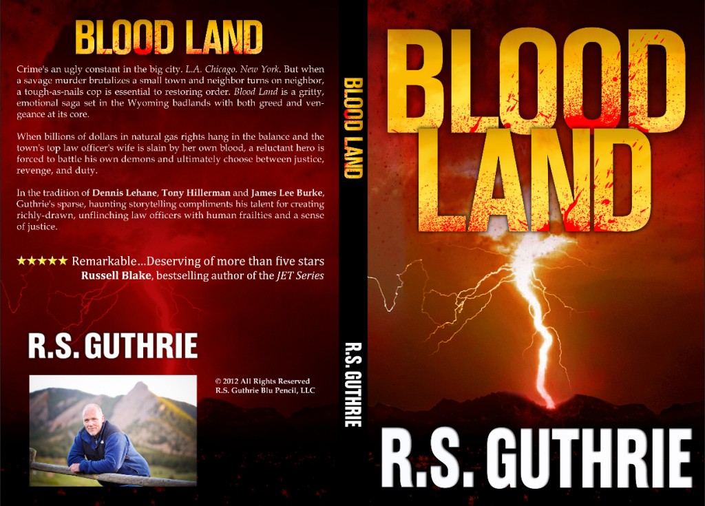
Blood Land
That is the new book. It’s already sold a few hundred copies and those who hold the “original” paperback, still for sale on Amazon until I can “retire” them in the next week, who knows? Perhaps when I become famous (another million years or so), you could hear a curmudgeonly collector saying something along the lines of “few know it, but Guthrie’s first in the series, Blood Land, it was originally called by a different name! Dark Prairies it was, and it was the same gritty, magnificent story but as the Ninth World War taught us: there can be too much darkness in the land, laying siege to the light, my friends. And so the name was changed, or legend says so anyway. Only a few copies were ever printed or sold. Even fewer remain. A signed copy you say?? Don’t jest. Guthrie hardly ever stooped to signing his own name…he became far too much like Russell Blake for that!”
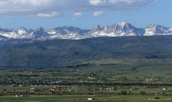
In all seriousness, take a look at the new cover in its entirety (I can show it off more because it’s not mine, so I am not being arrogant or an egomaniac, like some bloggers believe me to be. Nah, I am only keeeeeeeeding). The designer, he really worked his butt off and made a striking cover. And you who’ve never been to my home in Wyoming might not realize the detail, but anyone who’s even spent time in the Wind River mountain range, knows the skyline shape of the peaks. They’re there. On the cover. And my fellow Pinedale-ites will see it there, even in the dark storm:
The Dinosaur’s Ridged Back.
Fremont. The monster peak. With that small Wyoming town lying peacefully below it, completely unaware of the big city terror that is coming.
But it IS coming.
Finally, any of you who want to hire my wife as their manager are going to have to get in line.
It starts behind ME.
~~~~~~~~~~~~~~~~~~~~~~~~~~~~~~~~~~
The blank page is dead…long live the blank page.
~~~~~~~~~~~~~~~~~~~~~~~~~~~~~~~~~~


I like it Rob. I’ve already changed my reviews of the book to reflect the new title. Once you have the cover up I’ll replace that as well. It looks sharp. Your designer Ares did a wonderful job sir.
My article for Indies Unlimited a couple of weeks ago covered the topic of branding, and I mentioned how important it is to have a cover that stands out in the crowd.
The Blood Land title, as well as your name, grab attention, and the artwork is easy to identify. This is especially important for eBooks.
That nice large cover the artist sends must be reduced from a thousand pixels or more, down to just over one hundred. Potential customers should be able to read the title of the book, the name of the author, and get a sense of what to expect from the artwork.
Again sir, it looks sharp. Kudos’ to Mrs. Guthrie. 😉
Thanks, K.D. (and Mrs. Guthrie thanks you, too—it’s pretty nice having a worthy brain trust, of which I consider my regular commenters and writer friends a part)! 😀
Updated review on my blog: http://katysozaeva.blogspot.com/2012/09/review-dark-prairies.html
Original review is still there, but back a few months.
Thanks, Katy! As always, you are on the job! Hugs.
WOW the new cover is a winner Rob! This is a cover that will get the readers flooding in. As for Ares Jun he is amazing and is currently producing a cover for me too. So reasonably priced and great to work with. I shall be sure to check my reviews to make sure they reflect your new cover… All the best and I wish for you hundreds of thousands of downloads. 🙂
Thanks for the great wishes (and I would bet that Ares appreciates your extra shout as well)! He did a great job bringing the vision to life. Hopefully the words inside do him justice! 😉
Great new title. Great new look. It is a shame when the branding and marketing is more important than the story.
So, so true. I loved the original cover—not just because I designed and built it but rather it was Rob’s expression of what the book is about. I had my issues with the cover, too, and I totally LOVE the new one by Ares. So it’s a win-win. I’m going to auction the only “original” versions in case I ever become famous. Can you imagine someone with a mint copy of “Margaret”, the original name of “Carrie”? And signed? Meh…it’s a thought on unloading my three cases of printed books. 😉
Well done, Rob.
My $0.02 is to agree with your choice. Marketing is everything. It’s no insult to the story to repackage it if it isn’t working. There are countless examples of unsuccessful books being repackaged and then becoming successful.
If you want to take it a step further, consider Hollywood. Films get screened by test audiences. The test audiences fill out questionnaires the studio uses to evaluate the film. Have you ever seen a movie trailer for an upcoming movie, and then 6 months later you think to yourself, ‘Whatever happened to that one movie… Did it ever get released?’ The answer is No, it did not; the ending had to be re-shot and the entire marketing campaign had to be scrapped in order to figure out how not to lose a trillion dollars on it. Happens all the time. Figuring out how to successfully sell something as subjective as entertainment (books, movie, TV shows) is TOUGH.
Anyway.
Great job with the new cover. I suspect you’ll be in the Kindle Top 100 and then the Kindle Top 10 very soon.
Well done.
Rob – I actually haven’t gotten to Dark Prairies yet – so I won’t know the difference when I read Bloodland – but right off, I’d say this title and cover are striking. Maybe you should renew your wife’s contract!?!
Seriously though – Dark Prairies was a good title, but I think she’s right. I remember thinking what’s Bobby doing in the Badlands (that’s without even know if the Det. was in the novel).
It’s tough to make a switch, but brave. Good for you!
I know you haven’t…I saw your “Russell” comment about how with his recommendation you might just have to on the other blog. The interior (other than title page) haven’t changed at all, so no worries. Just a new title and cover to get the “Western” out of it. I’ll tell Amy; she’ll thank you. 🙂
Confused me for a moment I thought you had put out a new book 🙂
Though I am diggin this new blood splattered look. More elements of curiosity in it.
Yeaaah haar!
I just received the first copy of the new-cover paperback. I have to say it looks WAY GOOD. 😉