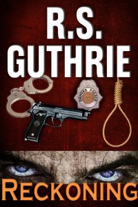
 I have the paperback version of Dark Prairies done and I #ammarketing like crazy, so yesterday I started back in on the third Detective Bobby Mac book Reckoning. I’m really excited about this book. It may not be my magnum opus, like Dark Prairies, but it is going to be the book that ties the Clan of MacAulay series into a nice trilogy and segues my main character back into doing what he does best: detective work; solving murders; putting the iron fist down on the bad guys.
Oh, and this third book has a bad guy. Bad, bad, bad. Unspeakable, this guy.
I’m really excited. But here’s the thing: I have a funny quirk about my book writing. I have to know what the title of the book is and, more importantly, I really like to have the cover completed before I get too far into the writing. For one thing, I am a visual guy. I like to have something to look at—it gives me the feel of the book even before I have written any feel into the book.
So yesterday, after a couple thousands words, I brought up my software and started thinking about what the cover needed to look like. For me, a cover needs to tell the reader little bit about the story while not saying too much. Then I really dug in. Before I knew it, the day was ending and I had a (mostly) completed new cover. Where had the day gone? I don’t even get that lost in the process when I’m writing!
I admit it. I love working on my covers. I’m not saying I’m the best cover designer in the world (or maybe even the county in which I live), but they work for me, and my readers seems to like them. I learn more each time I put one together. Of course I’ve been thinking about this cover for a while. During the process of getting my newest release out, I had already begun envisioning the next book’s cover.
Thing is, once the cover is done, the new book has begun to grow inside me (which helps me make the transition from missing my most recent characters and their world and puts me back in the mindset of recreating Bobby Mac’s world once again, albeit—for you Black Beast and LOST readers—ten years later).
 I did recently hire a web-design firm, thus giving up ONE of my multifaceted job descriptions in this, my own little company (writer, cover designer, web developer, marketer, venture capitalist, eBook formatter, interior designer, vendor liaison, etc, etc, etc.). The problem seeps in when “writer” is not at the front of the pack. But I’ve said it before: comparatively speaking, writing the book is the easy part.
So in a way, the cycle has completed itself once again. As Indies, we cannot afford to bask too long in the glow of our most recent accomplishment. We’re best compared to short-order cooks. Keep the food comin’. Stephen King may be able to write a book as often (or as infrequently) as he likes, but a book a year (or even two) ain’t going to cut it for most Indies. Unfortunately we can be forgotten before the glint has faded on the book we released just a month ago (assuming we’re a decent enough writer and good enough at marketing that our book gains a glint).
But I still haven’t answered my question, the one posed in the title of this blog. So here goes: No. I don’t love cover design more than writing. Writing is what I do. Cover design is a really enjoyable activity that augments my creative process. It’s a part of the book and it helps me engage the muse.
 And my muse, she wishes I was more like King, because after Dark Prairies she hinted at a nice, long, uncreative, unproductive non-writing intermission on a beach somewhere south, warm, blue of sky, white of cloud, and green of water.
Imagine her disappointment when I told her to get the heck back to work. That’s the only position in my little company that’s not mine (and I can’t put in print what she mumbled on the way back to her cubicle at the office in my head).
Pretty sure we’ll both be happy when we can fit a nice tropical break in there somewhere.
Until then, imagine the sound of the keys being brutalized on my laptop.
Another book, coming up. Fries on the side.
DING.
~~~~~~~~~~~~~~~~~~~~~~~~~~~~~~~~~~
The blank page is dead…long live the blank page.
~~~~~~~~~~~~~~~~~~~~~~~~~~~~~~~~~~
 Author known to use spontaneous satire, sarcasm, and unannounced injections of pith or witticisms which may not be suitable for humorless or otherwise jest-challenged individuals. (Witticisms not guaranteed to be witty, funny, comical, hilarious, clever, scintillating, whimsical, wise, endearing, keen, savvy, sagacious, penetrating, fanciful, or otherwise enjoyable. The Surgeon General has determined through laboratory testing that sarcasm can be dangerous, even in small amounts, and should not be ingested by those who are serious, somber, pensive, weighty, funereal, unsmiling, poker-faced, sober, or pregnant.)


Ahhh, laddie, you’ve got to learn that wily wench, your muse. She’ll lead you a lot of places, including that beach, then dump her load on you juuuuust as you don the Speedo. Then she’s off to frolic in the crystal seas and you’re schlepping back to the room where the ‘puter is.
I like doing covers as well, it’s a nice, creative break from the serious word stuff. Nice post, kiddo!
Yeah – I’m a total sucker for cover design and have worked up ideas almost as soon as I start getting into the project.
One thing I m not good at is Photoshop. I suck at Photoshop.
Using one of my wife’s groupons, I signed up for a class this month. It’s being taught by a photographer so i have a feeling it’s going to be more about dealing with RAW formatted pics, but that’s okay because I also take a lot of photos and have most of them saved in RAW so one day (when I learn how) I can really play around with them. 🙂
If you are responsible for your cover designs, I am impressed. You design as well as you write, and that puts you at the top of the heap, looking for a higher heap.
You always make me feel better about myself. May I one day hire you for my entourage?
So… I would LOVE to know how you go about making those covers 🙂 I could get into it the same way. I’d actually love to do a little interview for my blog with somebody who does their own cover art (but not for a few weeks minimum – minor surgery tomorrow).
I may have made a similar comment here before (sorry, I’m backlogged in checking comments I’ve made for replies!). But I am serious.
I use Photoshop (primarily). My advice is to take a Photoshop class to teach you about layers, effects, etc. That’s the ticket! 🙂
I agree that I must have the title before I begin a story! No title, no concept, no theme. And if the book is to be self-pub bed, I MUST have concept of the art.
Bravo for this post!
Thanks for the comment, Cerise! 🙂
Rob who did your recent covers? The ones for Reckoning, Lost and Black Beast. And what font type if you don’t mind me asking is that for the titles as it stands out wonderfully.