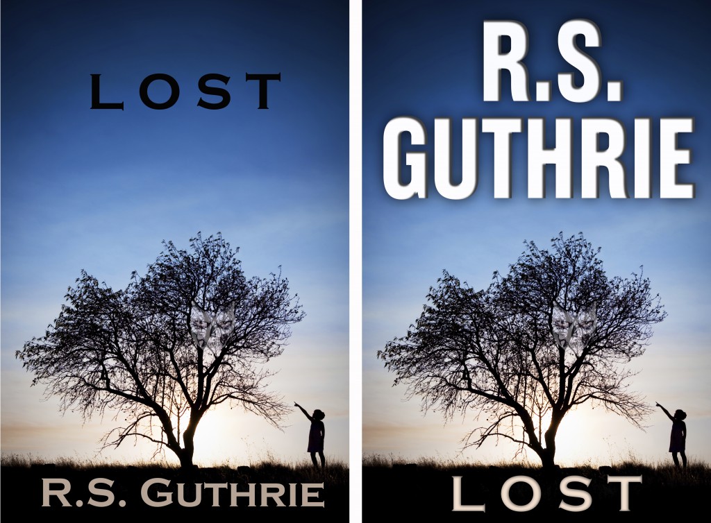
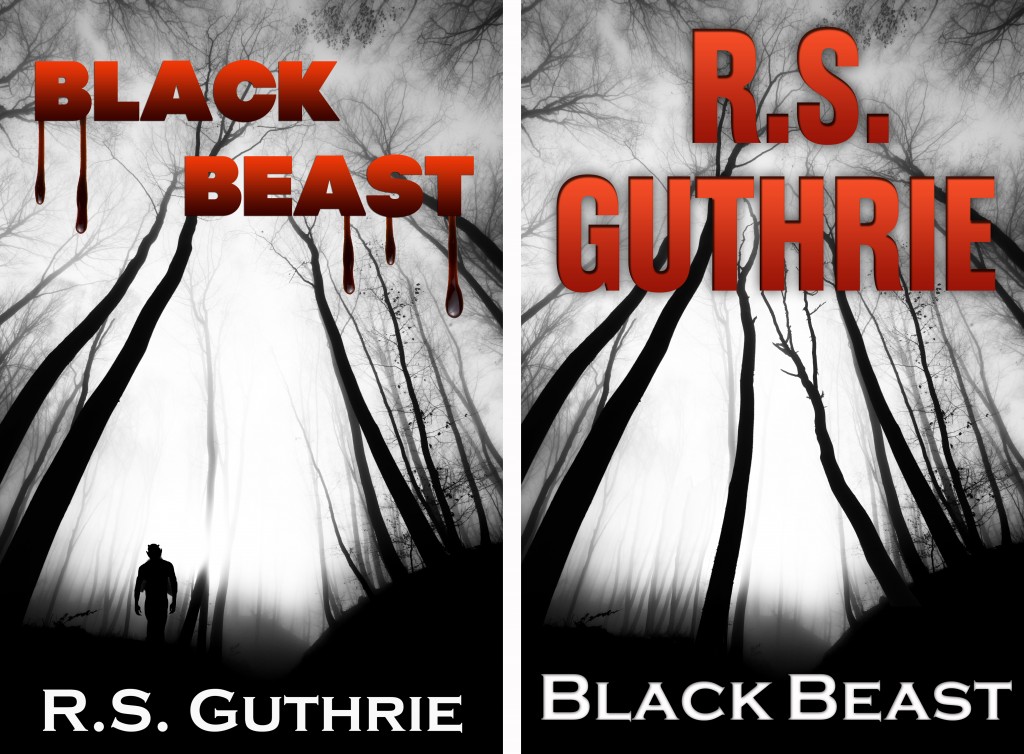
 I grew up in Wyoming, so I know a little bit about branding. However, as an author, I sometimes lose sight of its importance. To an Indie author—hell, to ANY author whose last name isn’t King or Koontz or Locke—there is nothing more important in the beginning. You’ve got to get your name in front of people. They have to see you that second or third time and remember you.
“Oh, yeah, I remember that name.”
It’s human psyche. If they remember it, the name MUST mean something, right? Whose book are they going to click on? The book by the “no-name” or the book with the author’s name they remember seeing before? It’s called impressions.
Recently I read a book by (and had a few conversations with) author Sevastian Winters. His book, How I are Becomed a Much Very Gooder Author, addresses some very interesting theories regarding writing and publishing, particularly from the perspective of the independent author. It’s a very good book and I’ll plug it here by saying I really enjoyed it and was actually already doing many of the things it recommends.
The one thing I was not doing had to do with cover design. Sev recommends that especially for the Indie author, it’s all about name recognition and branding and that very little really matters with your cover from a “buy” perspective than YOUR NAME. I have to admit, it really did get me to thinking (but not enough to change my cover designs).
 At the risk of paraphrasing Sev, what you want the buyer seeing when there is a page full of thumbnails (using the current digital example) is your name from across the air space. Yes art is cool and naming our books is one of the best parts (at least for me)—but in the end, particularly once you have fans, it is YOU they are looking for, not your title or the artwork you had done.
Now this is me speaking: I still care about my artwork and the title of my book. And I’m not suggesting (nor do I believe Sev was suggesting) that you not care about either of those. But the other day he read one of my books for the first time and he messaged me saying he was thoroughly impressed with my writing and as soon as I fixed my covers I was going to be “swinging for the fences”.
That was it. I bit. I’d agreed with most of what he said about covers and I decided to take the plunge and build a name (author) branding for my books and go with it. I have to tell you, whether you agree with me or not, I believe the book covers now cry PROFESSIONAL instead of INDIE, which is the main point of Sev’s theory.
So for your consideration (because I always include my readers in both my learning, suggestions, AND my own decisions) here are the old/new cover comparisons for your review. Feel free to comment. As I said, I agree with Sev: if I am looking at these books on the shelf (digital or otherwise), the name-branded book is the one I am accustomed to seeing. Oh, and here was my main argument against using my own name (as opposed to Dean Koontz or Stephen King or James Lee Burke using theirs) used to be?
No one knows my name. And do you know what I realized?
That’s exactly the point.


Oh, NOW you tell me! lol I just completely redid my five ebook covers! Well, I do have my logo on them, but not huge like this. Well, back to the drawing board! Great post…thanks, Rob!!
Hey, I’m not the messiah (that line just came to me because I watched “Life of Brian” again last night and kept thinking of him running around telling people NOT to take his advice)!! Seriously, though, it’s one perspective. I didn’t do it for a while and then it just made sense to me. I’ll let you (and the rest of the readers) know if it makes any difference. 🙂
Ain’t that just always the way. You bring me much fun and laughter, my dear, of the sweetest sort.
Rob, the new covers are simply amazing. “Pop” doesn’t even begin to describe how your name jumps out of the cover art. Nicely done.
I must admit I hadn’t fully begun to grasp the meaning of “branding” until recently. Seeing the difference between the two covers will make a definite impact on a consumer. Scrolling through hundreds of thumbnails, what are you going to remember, a title you saw 50 thumbnails ago, or a name that keeps repeating page after page?
I can’t commend you enough on how professional and clean the covers look. True stand-outs.
Thanks for the comment, Trish!! I have to tell you, I agree (and it’s okay because I am ultimately giving the credit to Sev anyway). 🙂
Rob, I vote for the new covers without any reservations. I am having my best month so far in sales and attribute much of that to the covers on the first two books in a series. I recently had Jeff Bennington redesign the cover on the first book which had been out a few months and also had him design the original cover on the second book. Both of them feature my name as in your examples. I have also seen sales of my two other books that are on Amazon this month and I can only understand that as an effect of people coming to recognize my name. I plan to redesign the covers on the other two books shortly and follow the same pattern with my name more prominently featured. My friend, Caleb Pirtle, has always said that people buy authors not books and I believe he is one hundred percent correct.
Thanks for the great blog. SW
You are more than welcome and thanks for the great comment! It makes me particularly happy to hear that the theory has been working for you (especially considering the fact that I just implemented it). It really does make a lot of sense. Of course, like everything else, if enough Indies do it, then the scales will change all over again and we’ll have to stop making our names so big to stop appearing unprofessional. 😉
This is brilliant advice! I’ve never even considered making my name big and bold on the covers because I always felt I wasn’t successful enough to do that. But I totally get it now; when I look at your covers, “professional” is what leaps out — not just because the new covers are actually better, but because I, as a reader, see your name and jump to the conclusion you’re a well-established author, which in turn leads me to assume your writing is professional, your novel is well-polished, etc.
The first cover in particular is a good example. Not being rude, but the original black title of “Lost” is… well, lost in the sky. Black doesn’t work. And your name is an odd shade of gray. It’s not bad at all, but it does have that DIY quality about it. The new cover does NOT look self-published; it looks like something I’d find on a shelf in a book shop. So you’ve gone from being a “poor, lowly, unappreciated self-published author” to a successful traditionally published bestseller. And that alone tips the balance and makes it “safe” for me to buy your book.
There’s less of a contrast between the original and new second cover; they’re both very good. But I still like the new one better.
I love this idea and will implement it immediately! …Well, maybe not immediately, but I’m definitely going to experiment with future titles and will redo my published series in the future.
Thanks! 🙂
Thanks for the response, Keith! No, I agree…the LOST cover had it’s own problems (namely the dark lettering in the blue). But thank Sev Winters for writing about it (I took HIS advice). You can still thank me for re-sharing it, though. I accept all major credit cards! 😉
Okay, I retract my thanks to you, Rob, and am thanking Sev instead. 😉
Also, I have an old credit card you can have if you want. It expired in 1994. Is that okay? Why do you need it? To scrape ice off the windshield in winter?
Keep up the good work!
Yeah, yeah, yeah… but I hear tell that Sevastian Winters guy is totally off his rocker…not to mention the fact that he’s a world-class-asshole! 😉 Seriously though bro; Those covers are GREAT. I’m glad to see some tangible evidence that my book had value for someone.
You know what they say about world-class-assholes, Sev—everybody’s got one. You just happen to be mine! 😉
Definite impact….I’m rethinking using my full name and romance and initials on mystery. Thinking about initials for both. Longer last name…LOL! I’ll be saving this article for when I get my covers designed. Thanks!
Good luck, Donna! 🙂
Great blog post. Good cover art is essential to the success of a book. I think it takes a lot of courage to put your name up there like that, but that’s what it takes! Looking for an book cover illustrator? Hire me. http://www.kirbifagan.com/blog/2012/4/16/hire-me-i-make-art.html
Or better than that, you could pony up the $8.99 and read the book! lol…. This article is good with the basic explanation, but the book delves into more…. such as the marketing theory behind book covers and author branding.
Rob, you are so right with this post (via Sev). Thank you for sharing it. I’m for the new covers too! Swing for the fences.
I’ve heard both sides of this debate, but after looking at your new covers, I gotta agree with you here, Rob. Because I’ve also heard it said that if you want to do something in life, you have to see yourself doing it. So if you want to be somebody then, by God, BE Somebody. Cheers!
Very interesting insight. I completely agree about recognition being the key. It’s also the reason I think authors (Charlaine Harris as an example that comes to mind) who use a theme in their book covers do well. I happen to think the covers of the Sookie Stackhouse novels are horridly ugly, but I would always recognise one, even without the title or author’s name on it and that makes them familiar ad attractive.
[…] recognition is the most important. The brilliant Mr. R.S. Guthrie will explain it to you better than I can, but I’ll give it a […]
Great piece and the new covers KICK ASS!
Thanks, Peg! 🙂
Not to be disagreeable, but I usually don’t like the covers with the name screaming at me. I have a negative reaction to them and always have. Mind, not as negative as when I can’t tell which is the title and which is the author (fictional example: Mary Johnston by Alice Cooper, but they don’t put the word “by” and are both large).
I do see why it would be good from a publicity/marketing point of view, but as a reader I want to see the title more than the author.
One thing I like about the re-done covers you provided is the fonts and colors of text are a bit bolder/higher contrast and larger. I wonder what it would look like to have the original layout (title on top) but use the new fonts…
Gosh, Shannon…you’re so disgreeable! 🙂 Totally joking, of course! I completely respect your opinion. In fact, it was my opinion, too, until a few months ago. Then I read two articles: one that talked about authors putting way too much into the titles of their books and another on author branding. The one about the title said something to the effect of “c’mon, short of the occasional witty exception, who really cares about the title?” It lt just resonated with me. And from an author branding standpoint, the sizing is self-explanatory (and I understand your gut feeling on that, too, but statistically, you want you name exposure. There’s always a dozen different ways to look at and as I mentioned I probably felt more like you did a few months back. The feedback I’ve gotten is well over 10:1, which as the author, while I’d love to please everyone, I’ll go with market stats. 😉 thanks so much for the thought-inspiring comment (and I don’t think you we being disagreeable, just stating your own perspective (which is a solid one at that). 🙂
I’m glad I wasn’t disagreeable. In case you didn’t know (and why would you?) I’m actually a statistician by trade. I never did market statistics, but I wonder if there have ever been any blind studies on this…
One last thing I want to say is that I completely get why a fledgling author (who wants to write and sell more than one book) would be highly interested in branding – especially if it isn’t a series.
The other side of that coin is that a good/enjoyable book with an easy to remember/catchy title will spread more quickly than the author’s name – especially if the NAME is not sleek (Stephen King = easy to remember, Ragnar Danneskjöld = not).
Which did you hear first?
Twilight or Stephanie Meyer
JK Rowling or Harry Potter
They’re both well-branded authors. Just like Stephen King, if one of those names is on a book, it will sell. However, being newer than King, you probably heard the title of the book first (I did).
So, if you’re going to name your book something like, “The Incredibly Long Book From Far Away” I would wholeheartedly put the name in the big font on top! If it’s short and sweet (and your first book) it might be worth placing the name in greater prominence.
As with all things, its a cost-benefit analysis. Upping the author’s name is good for the long-term, but might not be for the short-term.
Of course, I got stuck with such a common name that I needed to use my middle initial, so that probably biases me toward putting the bold font on the title.