I usually don’t recycle guest posts I do for other blogs, but this one is an exception. I think cover design is an important consideration for Indies and that makes it worth an extra blog run. This post originally ran on author Trish Gentry’s fantastic blog, ChickletsLit. I love reading her blog because she, too, makes it her mission to provide sage, timely advice to Indie writers. I want to extend a well-deserved thank you to Trish for hosting me in the first place and also for encouraging me to rerun my post on book covers and their importance here.
We’ve all heard the saying “don’t judge a book by its cover”. And when it comes to judging people, it’s probably pretty darn good advice. And even with an actual book, what should (and really does) matter is the quality of what’s on the inside. Face it, when’s the last time you HATED a book but thought “it’s okay, because the cover was INCREDIBLE!”?
Ironically, when I published my first book, Black Beast, I was fully aware of the importance of the cover. I’d read some articles and even spoken to a designer. So I went out and hired a professional. This guy was an incredible artist; I loved his previous covers. We worked out a price (not cheap) and then I proceeded to tell him exactly what I wanted on the cover.
 Mistake number one. I was too new with the market to understand what really popped, what kind of covers really attracted the consumer’s eye (and, more importantly, any particular symbols or types of things that might actually turn readers off). The artist produced exactly the cover I asked him to produce. He made a few suggestions here and there but I was pretty specific.
I wanted a priest, reading a book, with an ancient weapon forged from a cross lying on the table. I then wanted a dark creature rising out of the shadows behind him, as if he’s unaware.
As you can see here, he did a great job at producing exactly what I wanted. And I even received compliments from people on the artwork. So I thought I’d succeeded. My book was up on Amazon for several months before I decided to redesign my cover. I was selling books, but I was also a first-time author—how was I supposed to know if I was selling the right amount or if the cover was hurting me?
Then I entered a cover contest. Nothing fancy, but my cover received almost no votes. I was a little surprised, but come on, it was just one contest. Then I was involved in a book promotion around Christmas where the promoter offered a second follow-on promotion for any books they felt had covers worthy of generating purchases. Mine was not selected. Not even as “worthy of generating purchases”!
Wow.
I knew then I had to redesign the cover, no matter how much I’d originally paid for it. By that time I had already designed the cover for my second book, LOST, myself.  I’d noticed right from the start that my second cover was getting much better feedback than my first (this time I, too, could see the differences—in fact, whenever I needed to choose a cover to promote myself I always preferred the second cover).
My book, LOST, was due out on New Year’s Day, and once released it did so much better than Black Beast in terms of sales that I decided to try my hand at redesigning the new cover for “the Beast” myself. I used the skills I had acquired in designing the LOST cover plus I worked through some more tutorials in graphic design.
Once I had the first draft of the new Black Beast cover finished, I put the old one and the new one up on my blog and asked the readers to weigh in.
 I was stunned. I actually had responders state that they literally wouldn’t have purchased the book if they’d seen the first cover! I received outstanding feedback on the new cover. Even people that liked the first cover agreed the new cover was much, much better.
I changed the cover on Amazon and my sales started increasing that very day. The new cover made that much difference! I also get a lot more comments on the new cover (some suggested the priest and cross were too religious; I personally thought the piece he did was beautiful as art; it was not contemporary enough for a current book cover).
I’m not claiming to be the greatest designer in the world, and I’m definitely not suggesting that cover design is something every author should do for themselves—but I have always been pretty good with design and the fact is no one has my vision except me. Yes, yes, I know, that’s what got me in trouble in the first place. But now I don’t build my cover in a vacuum. I have my beta readers give me input on my designs (because they, too, have read the book—they know the mood, the characters, etc.). And I listen to them.
I also allow myself the possibility on each new book that I might not be able to do it myself. In other words, if it just isn’t happening, I have no problem at all bringing in a professional. But as long as my covers are satisfying me and my readers, I actually really enjoy doing the graphic work (it’s one of my favorite moments—I like having the cover completed early in the process, not unlike the movie posters being out before the movie).
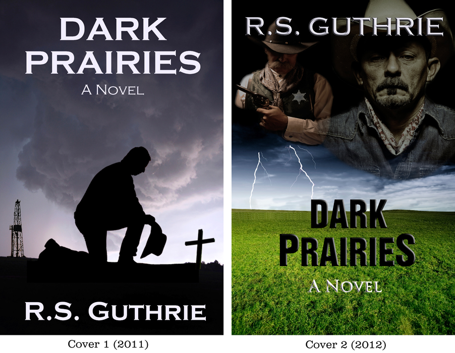
I have a new book releasing soon (Dark Prairies). I had a cover I put together in 2011 but redesigned it this year. That’s another advantage to doing the work yourself: you can totally change your mind and it doesn’t cost you an arm and a leg. I liked the first cover for Dark Prairies, but based on trends, things I had seen in the marketplace, and just my own gut instinct, I knew I needed something different. You can tell me if cover number two is better than number one:
The main point here is that whoever does your cover, the design and how it relates to your book (and mostly how it looks) is REALLY important. It is the packaging for your book and it is the very first thing the reader will see.
A great way to decide on covers is to have a poll on your blog or ask some of your beta readers which cover they like better. The elements should also convey something about your story, whether it’s a scene from the book or a mood or a setting. Look at your cover as if you’d just come upon it and see if it grabs your eye. Be as objective as you can and ask yourself that all-important question:
Would you pick your own book up off the (digital) shelf based on its cover?


Every actor knows that a movie without a good screenplay will be unsuccessful in the theatres no matter how great the special effects or the CGI. It is the story not the eye popping special effects that make a movie memorable. But with that said, what changes should I make to my outward appearance?
Hi, Regina. I hope you didn’t think I was implying content of the book isn’t what counts. I even said “what should (and really does) matter is the quality of what’s on the inside. Face it, when’s the last time you HATED a book but thought “it’s okay, because the cover was INCREDIBLE!”?” My point is that you first need a reader to pick your book up before he or she can read it. You may have a bestseller between the covers, but if your cover is awful, I promise you know one will ever know it. To use the movie example, studios put MILLIONS into the posters that come out before anyone ever sees the movie. Previews, too. You’re 100% right—as I said, no one is going to read a terribly-written book but still love it because of the cover! It is absolutely the content/writing that makes a book what it is. But the cover is what the reader sees first, and in a market with millions upon millions of choices, you need to catch their eye SO you have a shot at them reading your book! Thanks so much for the comment, too!! 🙂
I so agree with you and this blog. I had a similar experience with my cover and from now on will pay a lot more attention to what’s selling best in the genre I’m in.
Rob, Such an interesting post. I’m glad you recycled it…How did you learn to design your covers? Did you teach yourself?
Yes, pretty much self-teaching. However, I was already a fairly heavy, intermediate Photoshop CS user (amongst other programs), so that helped a lot! Thank much for the comment! 🙂
I think I’ll do a vote with my next book’s cover but so far I have kept my book covers to simple eye catching images. Black Beast’s first cover is a great piece of art but its too busy for a book cover. The second one is more suited but I’m not sure if I like it. As for the new book, I think I prefer the first cover. I don’t like photograph images on book covers unless it’s a book of a movie and I don’t buy those anyway. Just my opinion