 Well, my second book is out there and doing pretty well. WHEW! Yes, any of you that have published your book(s) know the relief that washes over the top of that rock in the middle of your chest once you are DONE—you know, the smooth stone of FEAR that won’t let you breath or swallow it is so insistent on ruining your day? And yes, it’s true, the relief of reaching the finishing line doesn’t do much except clean the stone a bit as it rushes past and over it to sate the other less-stony parts of your body.
Will they love my new book? Will they even like it? Have I just embarrassed myself beyond all other moments in my life by releasing this manuscript into the wild of the market and critics and…
But the fear eventually fades. I can tell you, though, good book sales and decent reviews really help. In fact, they are like a jackhammer in their ability to smash your fear stone into a billion insignificant little pieces. So like I said, the new book is out there doing well and the fear has been smashed, so life is good for the writer. Right?
RIGHT?
No, that’s not right. I realized the other day that the cover I paid $1000 for—the cover for my FIRST book; the cover I love and that many others purport to love—doesn’t POP.
I know, I know, you are sick of the term “pop”, but I just started using it recently so I’m not sick of it yet. And I think the term applies particularly well in our line of business, where your cover really needs to jump out at readers. I have had TREMENDOUS response on my new cover, which I actually did myself (mostly because I could no longer afford to buy a cover—my book didn’t hit the bestseller list as quickly as I had hoped. In other words, I haven’t fully paid for the first cover yet, much less squirreled away enough to buy a second).
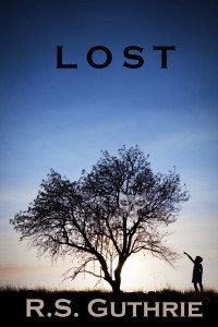
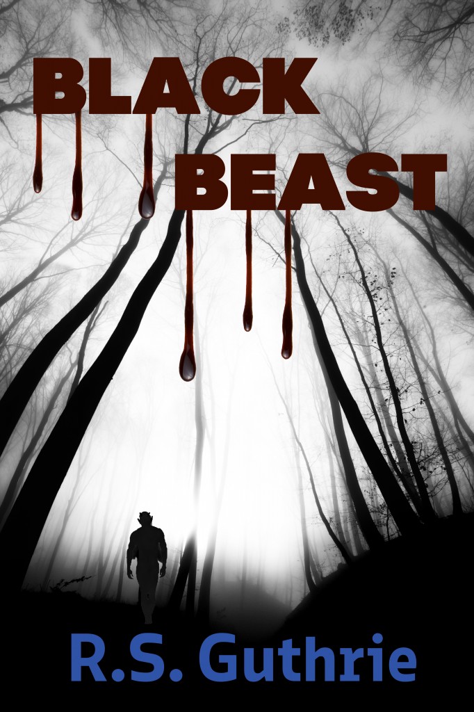
SO, I put together a new cover for Black Beast. I like it. The wife likes it (and she is a hard ass when it comes to matters of design, so that helped). My great friend, beta reader, and proofreader loves it. Still, I figured why not give YOU, my dear blog readers, a chance to weigh in? I will put both covers below (obviously L O S T, the new book, is at the top—I love that cover, so if you don’t, kindly shut your pie hole. Just kidding, you can weigh in on that one, too, but I am not redesigning it, so your opinion will likely go straight into the circular file. Just being real.).
Seriously, let me know. Oh, and if you haven’t bought the new book yet (or, God forbid, the FIRST BOOK), please do so…Black Beast is 99 cents right now and L O S T is only $2.99. I hope I don’t need to remind you the two of them together still cost you less than a grande latte at Starbucks (that’s a MEDIUM for you fancy coffee barista -challenged common folk). Oh, and if you haven’t heard, each purchase also gets you a chance to win the new Kindle Fire I am giving away! Details on THAT sweet deal are here.
So, on with the unveiling:
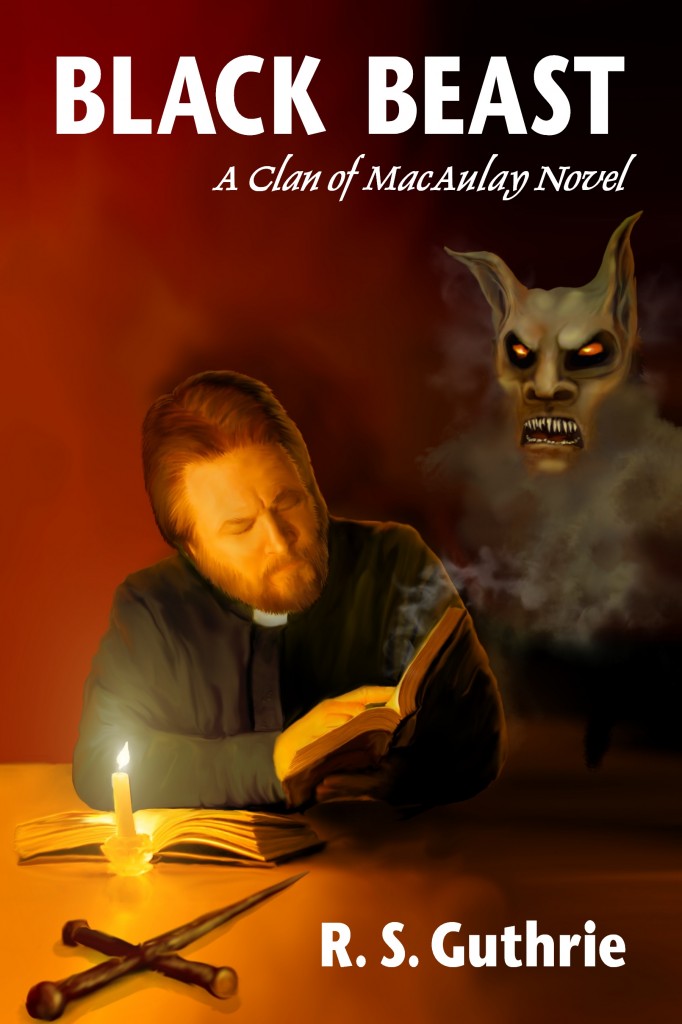
The original (current) cover:

So if you don’t mind, leave your comments below and let me know what you think. I won’t talk a lot about what I believe is happening with the the first cover, but I CAN tell you that I am running an ad on Goodreads and I just wasn’t getting any clicks. I had a daily limit, which amounted to 10 clicks per day, and there were 36,000 views (i.e. page impressions) and only 18 clicks over almost a week! By then I had released L O S T, so I changed the ad out from the Black Beast cover to the L O S T cover. over the next day there were about 6,000 page impressions and I got 18 more clicks! If you do the math on it, that means I increased my ad’s clickability ratio (my new word) 5900%!
So I think I proved that there is a “pop” or likability problem with my original cover. Tell me if you agree and if you like (or don’t like) the new one.
I would really appreciate it. And buy the books, if you haven’t already. The inside is better than the outside, I promise.
~~~~~~~~~~~~~~~~~~~~~~~~~~~~~~~~~
The blank page is dead…long live the blank page.
~~~~~~~~~~~~~~~~~~~~~~~~~~~~~~~~~


You’re right! I love the new cover. Good luck with it.
Thanks, Marigold!! I really appreciate the feedback. Happy New Year! ツ
Rob, just a suggestion (but I do like the new cover better)… Do a gradient color for the title font (brighter shade of red at the top, flowing into a deep, dark red at the bottom). The name in blue would ‘pop’ better in white lettering. Easier to see your name when the image is reduced, which will happen a lot when the cover is featured on a blog. Just my .99 cents worth. 😉
–Rush
No contest; the second cover is way better. Good luck!
Thanks, Suzanne! Votes seem to be unanimous so far. Appreciate you giving me your vote! 🙂
Wow Rob I am loving the new cover! I liked the old cover too, however I really do prefer the new one, it grabs your interest instantly! Loving it… Well done on”Lost” loved your post! I paid £80 GBP for my first book cover! I so love your posts, I am reading “Wild child” right now by Mike wells. your book “Lost” is lined up to read next on my kindle!
Thank you, Dawn! I can’t wait for you to read LOST and let me know what you think! 😀
I love the new cover, Rob!! I agree with the opinion of using a more gradient colour, but it is fantastic. It catches the eye immediately and quite effectively. Well done!!
The new cover is excellent, Rob. While I really liked the book, I always thought that first cover was way too literal, and was more suited to a comic book than a novel.
The new one evokes an emotional response that is much closer to that provoked by the novel itself. And like you say, it pops.
Good luck with it!
Thanks, Scott. Great point—you pretty much summed up what concerned me about it from the beginning. The artwork is actually fantastic, but it just doesn’t fit the genre, etc. Appreciate you weighing in! 🙂
I want to thank everyone who has commented so far…you all have REALLY helped me flesh out the final design (now resides on the blog in place of the old one). Special thanks to K.D. Rush who NAILED it with the “gradient” suggestion, among others!
Okay. I am LOVING the new cover. It does “pop” more! It looks great, Rob!
Thanks, Em! I really appreciate the feedback. I’ve uploaded the new one, so it should be live today sometime! Cheers 😀
I agree with everyone. The new cover evokes a feeling of mystery that pulls the reader in. Maybe that’s an important point. The new cover gives the reader an eerie place to investigate, and you know people, they love to check out scary stuff 🙂
Great point! You really do want to lure the browser in to want a close look (inside)! Appreciate the comment, SS! You rock.
The new design has an immediate impact which appeals to me and once you get that impact, there is a wonderful sense of foreboding. Yeah, big tick from me here too Rob.
Dean! Thanks for dropping my, my friend. I appreciate you weighing in—your opinion means a lot to me! Hope things are well. Cheers, brother. 😀
The new cover is better, in my opinion. It looks exciting, chilling & immediately draws you in. Love it.
Thanks, Jane! I really appreciate you checking it out and taking the time to give me your take. 🙂
I think the first cover would actually have put me off looking at the book, but the second is mysterious, ethereal and has a draw to it, especially the gradient, definitely works!
Thanks, Lisa! I appreciate the feedback…seems like I’ve had the wrong cover out there for a while! 😉
I do prefer the new cover.
Just a couple of suggestions:
Don’t make the figure gray. His silhouette should be black also. It also doesn’t seem to be in line with the perspective of the forest.
And I would choose another font, especially for the author name. And don’t make it blue, since everything else is monochrome with the blood-red as the spot color, make it maybe another shade of red. Maybe a thinner, smaller font for the author. I really like what you did with the blood.
Thanks, Meghann! Great suggestions…I changed the cover (one last one based on some recommendations like yours) and the new cover is actually now on the page margin. Cheers, and thanks again for weighing in! 🙂
I’m in agreement with all of the above who prefer the new cover – in my humble opinion it is a HUGE improvement. Glad to hear the book is doing well, btw…
Thanks for dropping by and letting me know! (And thank you for the congrats!) 🙂
Mr. Guthrie,
The new cover is excellent and allows me to find my own black beast in yours. I really love that you’ve asked your blog readers to give input! Best wishes with your writing,
Tonya
Mr. Guthrie,
The new cover is excellent and allows me to find my own black beast in yours. I really love that you’ve asked your blog readers to give input! Best wishes with your writing,
Tonya
Thanks, Tonya! I thInk it’s great that you responded (and everyone else)! I figure who knows better than the readers? I really appreciate you taking the time to read and comment. Have a great weekend! 😀
The new one is a winner. Hats off to you to have the moxie to throw the other to the wind regardless of investment!
Thanks, Christina! Yes, a tough call, but that’s why I pay myself the big bucks. Wait, I do pay myself the big bucks…..right? 😉
I’m relatively shocked you paid $1000 for that first cover (I do hobby-level cover art; sometimes my stuff is worse than that, but usually not imo). The second one is definitely a step in the right direction. I’d personally want to play with the levels a little bit more (and maybe pull the slick/wet glisten into the title text some). Still, massive improvement. 🙂
Thanks, Kaolin! I really appreciate you weighing in. It has been great to have everyone’s perspective (and I find it amazing that most people seem to have the same thoughts—that makes it even more convincing)! 😀
The new cover is a vast improvement. Someone else commented that a gradient of reds for the title might work better and I agree with that – sort of pulsing open wound blood red for the letters darkening to congealing blood red for the drips. I’d darken the gray man to black so he appears to be part of the picture rather than added in. Perhaps a lighter color for the author’s name as well, but I don’t think white… perhaps chartreuse to increase the observer’s feeling of queasy anticipation.
Thank you so much, Melissa! The finished version is not up on the right side of the site. It’s funny…I never intended for the figure in the forest to be a different color, but with my eyes I did not see the difference! I am really thankful that others saw it, because I totally wanted it to be black in the first place! {{whew}}. I really do appreciate you lending me your thoughts! Cheers 🙂
I liked more the old cover, I wanted to tell you before seeing this post.
However my opinion seems minority 🙂
I like very very much the L O S T cover, much than the first or second cover of Black Beast, it seems an entirely different category, more professional.
Thank you for jumping in the water, Stefano (and I admire you for putting your opinion out there knowing it is in the minority)! I am glad you said that about the original—I happen to think the artwork in that one is superb. It was my vision and the artist did everything I asked (and it turned out better than I had hoped). As you can see even from the comments here, it just didn’t work for this particular book. But I still like the artwork very much! Thanks again…:D
I would never have bought the book using the first cover but the second one screams READ ME. Much better…glad you reworked it, should definitely sell better.
Thanks, Donna! I have been overwhelmed by the comments and support (particularly the positive response to the new cover)! It seems to be working, too, because sales are much better. I guess in some instances people ARE judging the book by it’s cover, eh? ツ